| A (first)
introduction
to architecture modeling with Blender
|
| by
Yorik van Havre |
|
| This tutorial is
a general but
step-by-step introduction to quick architecture modelling with Blender.
It is
focused primarily on architects who never really used Blender but know
some 3D and who want to see how Blender can be used for their
particular
work. Blender users who are not used to architecture might find it
useful too, although probably very simple. I will try to go slowly and
explain everything, but there will be a couple of little things you
will need to find out yourself... I am sure it is not hard and by
searching a bit you'll quickly find your way. A good idea is to leave
the blender
manual open in another tab... And if you get really, really
struck, just mail me... |
|
| This tutorial is
about quick modelling, for building a well rendered image. It
will
not explore the details of precision modelling. It won't give you a
correct model, that you could use to generate plans and sections.
Instead, we'll try to find a balance between speed and correctness.
Precision modelling takes much more care and time, so we'll treat that
another time :) But I hope you'll be convinced, after reading, that we
can obtain a pretty good balance, and while we may not be precise to the
centimeter,still we should achieve a correct representation of our
building.So I will try to mix
a bit of all this and start with a true, real-life,
everyday-experienced situation that you probably know too well: |
| |
| 1.
THE STORY |
 |
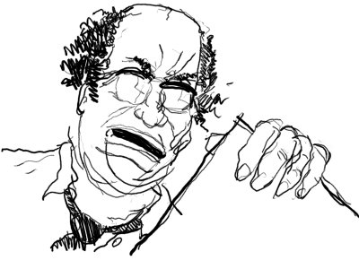
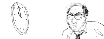
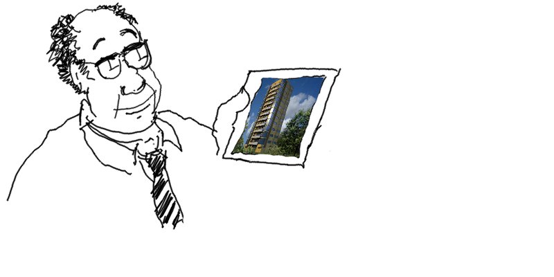
This sympathetic
person is your boss (no it is
not Mario
Botta, unless Mario Botta is your boss, in which case don't read this
tutorial at the office). He has drawn a very quick project this morning,
and he would like you to mount a quick perspective of it so he can
impress the client and sell the project.
Of course it is now 9:00H in the morning and he wants it before 13:00H,
because at that time he will have to go out for lunch with important
people in an expensive restaurant in town and he wants to show them the
image.
It is a little appartments building, 12 stories high, to be projected
for some location in the city. |
 |
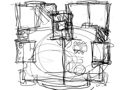
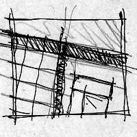
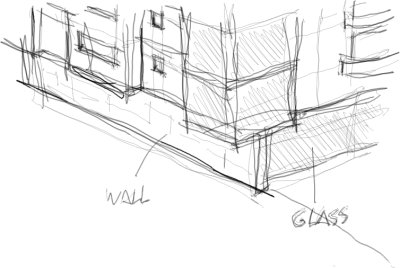
This is the
thoroughly detailed piece of art your boss
wants
you to transform into an image capable of hypnotizing the client.
Before you could even understand what is represented there, the boss went
away to call one of his very important contacts.
Since there is not much information shown there, we'll have to invent a
few things. This is quite common in 3D. The person who wants
to see the project in 3D rarely has a complete idea of what he wants.
Our boss, clearly, has no idea at all.
So don't be afraid to invent, develop, do what you want, as long as he
can recognize his "design" at the end. Actually we are going to use
this drawing as a base, but most of the things we'll have to invent
when we do it. |
| |
| Just as a note,
if you are new to
blender, you probably will need more than 4 hours to complete this
tutorial, but I guarantee you that when you know blender well, doing
this in 4 hours is perfectly possible, maybe even faster. I hope that
at the end of this tutorial you'll believe me! |
| |
| 2.
THE PREPARATIONS |
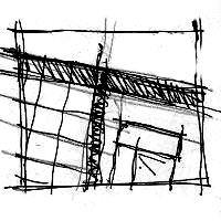
First thing we
are going to do is to
scan the drawing. If the drawing is bigger than the scanner, reduce it
with the photocopy machine so it fits into an A4 sheet, or any format
your scanner can scan. We don't need much resolution. Scan it in
greyscale (it makes smaller files)
and any resolution will do. Let's scan it at 300 dpi, which is normally
the default resolution on most scanners. It will be much more than what
we need, but we might need the drawing at a good resolution later, so
better scan it one time for all. We only have 4 hours. Save it in
whatever format you like, but jpg (with at least 85% quality) is fine.
Now we need to clean the scanned image. Open your image in your
favorite image editing program. You don't have a favorite image editing
program? Then download the
GIMP,
which is a very good open-source image manipulation software. In fact,
the Gimp is Blender's best companion... Many image professionals will
tell you that Gimp is not good enough for them, but it is perfect for
architectural work, since we rarely need to work with absolute
professional color
precision.
How do we clean our drawing? We need to make it as clear as
possible. So we will:
|
 |
 |
 |
 |
1:
Open the image
|
2:
Resize and crop the image to what we need |
3:
Increase the contrast between black things and white
background using the color>levels tool |
4:
If necessary, finish the cleaning by hand, using the eraser. Just erase
what's still very dirty |
|
| Now we already
have a good base to
work. Or at least, the best possible. Last thing to do, since we will
use this image as a background in blender, is to make a smaller
version, otherwise it will slow down your work much. Save a version of
the image that fits more or less in a 1000x1000 pixels square. That
should be enough for you to see the details and for blender to work
fast. |
| |
| 3.
THE BASE PLAN |
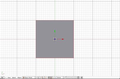
| Now our image is
ready for use. Let's open blender: |
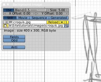
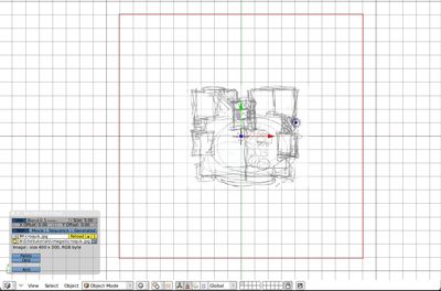
and locate, in
the view menu, the background image panel: |
 |
 |
That
panel allows you to
load an image and put it in the background of your view. There are
several interesting options here, play a bit with the Blend value
until it all looks comfortable. Next, a very important
thing: We will put that image to scale. For that, obviously, we need to
KNOW what size the building is. Well, the boss didn't tell us... We'll
have to guess. There are a couple of things we can see:
- The elevator is easy to see, at the center of the
building.
It has stairs around it. An elevator is a square of more or less 2.00m
x 2.00m. These types of common stairs usually have a width between 1.00m and
2.00m, let's decide 1.50m.
- There are two rooms on each side of the
elevator/stairs
box. Usually a room has between 9.00m² and 12.00m², let's
shoot for 11m². The proportion of those rooms looks something
like 3/4, so that will give us a little bit less than 3.00m for the
width. (3m x 4m would give us 12m²).
- We can now estimate the total width of that building,
it
would be something like 3m + 3m + 1.50m + 2.00m + 1.50m + 3m + 3m =17m.
Let's put it at 18m, because we know that during a project development
areas often tend to reduce, because we architects forget a lot of
things
when we begin a project... That 1m more is our little reserve for later.
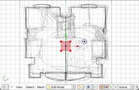
Now place yourself in top view (Numpad 7 key), in case you are not.
Remember to press that key again whenever you want to get back to top
view.
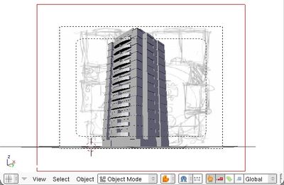
Now things are easy. We have a 18m-wide building. So let's prepare it.
Select the default blender cube and erase it. Instead, add a plane
(SPACE key menu, add mesh, plane). Switch to wireframe dislplay (Z key)
so we can see through it, and get out of edit mode (TAB key). Then: |
 |
 |
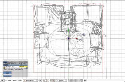
| 1. Scale the
plane (S key) so that its width occupies 18 grid units |
2. Increase
values in the Background
image panel so that the image comes to fit in the 18 units width. We
can now see the building mesures about 17m in length... |
In this example I
chose to work in
meters, so I decided that one blender grid unit equals one meter. I
could have chosen something else, of course. I can also do all the work
in meters, when it is still early in the design process, and scale it
by 100 to work in centimeters later.
In all this exercise, we won't worry much about precision (I have vague
plans to treat that in another tutorial), since obviously our boss is
not worried about having a precise result. So we will use much our eye
and our sense of proportion to determine the size of things. What is
important, whenever you work without precision in architecture, is to
keep in mind what is important.
For example: You see in the second image here above that it is
difficult to know how to scale the image. The "walls" from the sketch
occupy almost one meter! Should we scale it so our plane line becomes
the exterior line of the wall? the center? the inner line? Look at the
size of the rooms: We talked about 3m x 4m, and it is more or less
there. So for me it is ok. "More or less" is a perfectly acceptable
dimension in architecture, as long as you don't forget what is
important: In this case, the people who will live there. Until the end
of this exercise, always keep an eye on their spaces.
Now save your work (Menu File>Save). Don't forget to save often
during this exercise. An accident can happen easily :) |
| |
| 4. THE STARTING
PLATE |
| The most natural
way to build
architecture 3D models is to do the same way as they are built in real
life: From the ground up. Of course for different types of building you
could imagine different ways, but this is a very basic building: It
will be like a big cake, with 12 levels and topping cream... So let's
start from the ground. We will build first our typical floor unit,
since it will be easy to duplicate it 12 times, and we will already
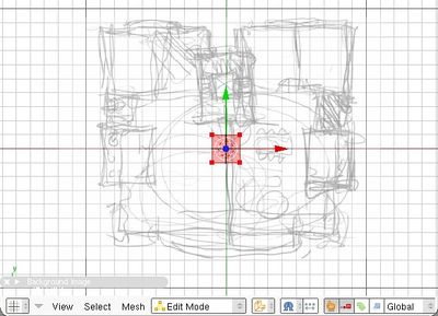
have 80% of our building ready. So let's begin. Let's add a new plane
object, that we will remodel until it becomes our base plan: |
 |
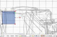
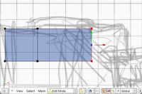
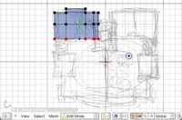
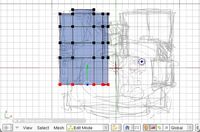
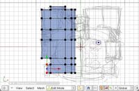
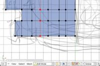
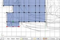
We will now
begin to extend our base plane,
moving the 4 first vertices to some correct position, then extruding
and adding new vertices. First move (G key) the first four vertices
(they are
already selected) to a good position, for example a corner (first
image). Next, deselect the 4 vertices (A key) and select only two, that
we will extrude (second image): |
 |
 |
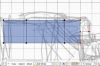
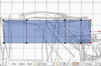
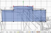
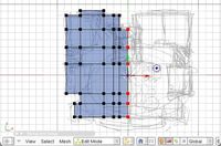
| Now the trick is
to analyze your
plan, and look at where you will need divisions. We will extrude (E
key, then only edges) our vertices several times, so we create vertical
lines where we will need them. Don't forget you can force the extrusion
to go horizontal or vertical pressing X or Y key while extruding. |
 |
 |
 |
 |
You should see
now why we didn't
extrude the whole length in only one big extrusion; we needed vertical
divisions so we can extrude the balcony above. Of course, it would have
been possible to extrude once, and then divide (CTRL+R) the face
several
times, we would have got exactly the same result. In Blender, as in any
good program, there are always several ways to obtain the same result.
|
| In case you begin
to get confused with keyboard shortcuts, Blender has a quite impressive
toolbox,
which is accessed by pressing the SPACE bar, or keeping any mouse
button pressed for a coulpe of seconds. All actions that we are
performing in ths tutorial can be accessed via this toolbox. I
recommend you to have a look at all that lies there. There is also a hotkeys
reference chart. |
| |
Very likely you have noticed our building is perfectly symetrical.
This is quite common in architecture, a bad and old habit that comes
from antiquity and that architects use a lot, because it is easier and
they are lazy ( though they may tell you any kind of other reasons). Well, for us it
will be easier.
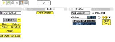
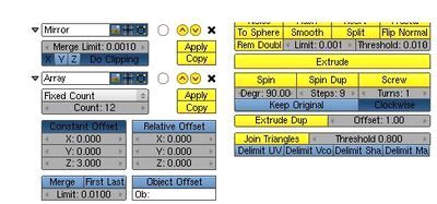
We will simply add a mirror modifier to our plan, and
everything we'll do on the left side will be also done on the right
side. We can do it anytime, but let's do it now, so we have the
pleasure of seeing our work growing at double-speed... Switch your
buttons window to Editing (F9 key) and locate the Modifiers tab. Then,
add a mirror modifier: |
 |
 |
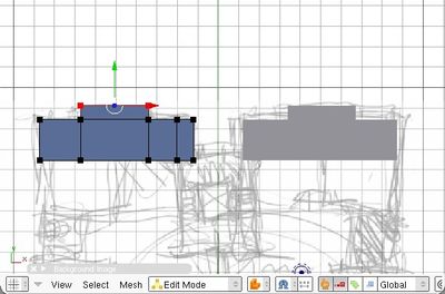
If you switch
back to solid mode (Z
Key) now, you'll see that the work we have already done has been
mirrored, around the original center of our object, the one it had at
creation time, that is, the place where the cursor was when we created
the plane. By luck, it is exactly where we want it.
Let's continue, and fill the rest of our plan the same way: select 2
(or more) vertices, extrude, stopping at every change in the geometry... |
 |
 |
 |
 |
| If you activated
the "Do clipping"
option of the mirror modifier, you'll notice that you can't extrude
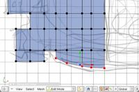
anything across the mirror line. Very useful feature. Now there are
still some subtilities of our plan that we couldn't achieve with
extrusion. For example the lower part, or the curved balconies... There
we'll do a little more precise work, by cutting (CTRL+R) faces or
edges, moving and extruding single vertices, and creating faces (F Key)
between vertices: |
 |
 |
 |
 |
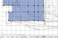
| Experiment a bit
with all this, don't
hesitate to delete some of your vertices in order to re-extrude faces
correctly. You see here above that we can easily cut through faces
(CTRL+R with at least 2 vertices selected) to create new vertex lines
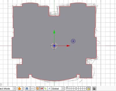
through our mesh. Do all the adjusments that are needed, and go out of
edit mode (TAB key) and put in solid mode (Z key) to admire your work: |
 |
When
you are done, you
should have something like this. If you still have imperfections, enter
edit mode again (TAB key) and work a bit more on it. Remember that you
can extrude one single vertex (it will produce an edge) and make a face
by selecting 3 or 4 vertices and pressing the F key. Try to reproduce
the maximum of details, angles, holes, corners, because it will look
better under the light. They will create more shadows. Don't hesitate
to add a bit more here and there. Remember, our boss will have the
impression he created it... Just don't add too much. Just
"interpret" his sketch the way you prefer. The best way to obtain good
results is always to model things you like...
Also, have a look at all the modelling tools you have in the toolbox
(SPACE key)... There is also a chapter
in the manual describing it all.
|
|
| 5. THE MAIN VOLUME |
Next thing, we'll
put some volume to our plane. There, we'll need to be
a bit smart: Remember how we extruded things in several steps, to
create vertices where we needed them? We'll do the same thing
here. So we need to make a bit of planning: We need to know what
heights we will extrude.
We will decide for a standard floor
height: 3m. It could be less (or more if you build high-standard
appartments), but let's stick with something easy to manage now. What
elements will we need to model on our façades? We'll have
windows and balconies. That's about it. So let's see: balconies usually
have about 1,10m. For windows, it depends: what kind of window? We'll
certainly have big sliding windows that open to the balconies. They'll
go from the floor to, let's say, 2.20m high. Remember that nobody will
build anything based on our work. We don't need to be precise. We need
to show more or less
how it will be. I know that with 2.20m I'll be close to what it
will be at the end, be it 2.10m or 2.40m... That's enough for now.
What else. We have probably smaller windows, for the kitchen or the
rooms for example. We could make it from 1.10m to 2.20m, right? so
we'll already have the horizontal lines, and all those things will be
aligned, it will look better. Again, if later it'll be 1.20m instead of
1.10m, it doesn't matter for us now. Let's keep it simple.
I think that's about it. Maybe we'll have one of those small bathroom
windows too? Let's put another line, let's say they have 60cm height
and are aligned with our 2.20m line.. So their base would be at 1.60m.
So, resuming, we'll need a line at 1.10m, one at 1.60m, one at 2.20m
and one at 3.00m, the final one. So let's do it: Go back to edit mode
(TAB key), and select all your vertices (A key until all is selected).
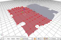
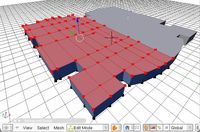
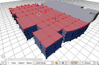
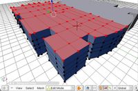
Extrude (E key) region, and type 1.10. enter. We just extruded all our
plan to our first line. Do it again 3 times,
using 0.50, 0.60, 0.80 distances. If by
chance your
extrusion went in the wrong direction, undo it (CTRL+Z) and force it to
follow the Z axis (Z key) before entering the distance. This is because
blender evaluates himself how to place the normals, which is not always
the way we want them. |
 |
 |
 |
 |
| Great. Our first
typical floor unit
is already there. We'll now need to sculpt the balconies and
the
windows. But first, same way as we did the mirror, we could already
have a look at how it looks with the 12 floors... Add another
modifier: An Array modifier. Put its options on constant offset, z: 3m,
count: 12 like below: |
 |
 |
Well, not bad for
a start, our
building is here already. Now the boss can come, things will go faster.
Ah, don't forget to save your work often, ok? Blender might crash some
time, just like any other program...
Notice there is a small icon in the array modifier to switch it off
when you are in edit mode. Very useful so you can continue to work on
your typical floor, but when you'll go out of edit mode you'll see how
it looks on the whole building. So let's begin to work on the back
balcony. Select the vertices you don't want, delete them, and
extrude others to re-form the geometry. Don't forget you can force
extrusions and movements in a certain direction (X, Y and Z keys) and
also that you can extrude (or move) a certain distance simply by
entering it while extruding. You can also recreate faces when you have
their 4 vertices ready by selecting them and pressing the F key.
Another trick, you can work on vertices, edges or faces by switching
the corresponding button in the header bar... Sometimes it is easier to
work on vertices, sometimes faces, etc. You'll get used to it. |
 |
 |
 |
 |
| That will do it
for now. Notice that
I extruded a bit the windows inside, so it will give a little shadow
when we'll render. For the rest, I didn't detail much the balcony, but
most probably we'll do a view from the ground, so it doesn't matter
much now. Let's create windows the same way in other places. Since the
boss didn't draw any window, we are free to place them where we want,
just like the ones here above. Try to have them fit in the lines we
already have, so those lines will get reinforced, making our building
look better, and it'll be easier for us too... |
 |
 |
 |
 |
| The living room's
corner box wasn't
very well drawn by the boss. This suggests he wanted "something" there
but couldn't find an idea. This is where we can act, do something
interesting, and he will naturally think he's the one who designed
it... Fine for us... So let's do something. By lowering the 1.10m line
and raising the 2.20m line, I made a kind of big glass aquarium
there, so it will look like a giant glass column... And the apartment
inside will have plenty of sun. You may choose to do something else,
feel free :) |
| Let's finish it,
make the front balcony, and put some last windows here and there, on
the front and on the staircase, at the back. |
 |
 |
 |
 |
Okay! I think our typical unit is
more or less ready. By now you must have understood well how vertices,
edges and faces behave, and how to switch from
one to another. To remind you if you didn't find out, there are those
small buttons in the
3d view header, in edit mode, that switch between vertices, edges and
faces.
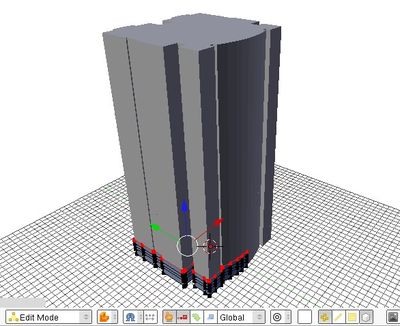
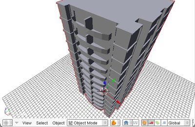
Let's get out of edit mode to see how it looks with all the floors:
|
 |
| |
| 6. THE FOOT AND
THE HEAD |
| Alberti said it,
a building is like a human body:
It must have feet, a body and a head. Well, our body is already there,
we need to provide
a head and a foot. Let's begin with the head: What can we do up there?
We'll have some stuff,
elevator's machine room, maybe a couple of technical rooms... We could
just use them to create
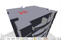
a nice volume work. So let's create a new plane object, and lift it to
the top, to begin to work. |
Before we do that, it might be a
good idea to rename our body object, so later,
when we'll have many objects, it'll be easy to find it in objects
lists... Locate where the object's
name is in the edit buttons below, an OB:Plane.XXX button. Rename it
to, let's say, Apartments.
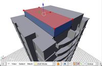
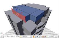
Now let's invent something for the top: Add a new plane, add a mirror
modifier to it, and place it
above the 12 storeys: |
 |
 |
 |
 |
 |
| Okay, that will do it for now. Later
on we can refine it, but it is better
to arrive quickly to a first "displayable" result. We don't have the
whole day, remember. Let's switch
to the foot. There it is more difficult, many famous architects have
had many theories about treating
the foot, over time. I will stick to a typical Moretti-style foot:
simple, stone, smaller... What will
we have on the ground floor? I don't care now. Let's just make it look
nice, there will be many things to
put in it later... |
| It is always a good idea, if you
don't have any idea about what to do, to make a small
sketch, that you can put as a background if you want, but in most of
the cases it is not necessary, just
the fact of drawing something on paper is enough to give you ideas on
how you want your base to be. After
that, you model much quicker because you alreay know what to achieve.
When you get much used to Blender, you end up modelling directly,
as-you-think... For now, let's sketch quickly something: |
 |
 |
 |
 |
 |
| Fine. See that I raised the body and
the head 3.00m higher, to
give us space to work. Also remember that you have several view-related
shortcuts (Numpad
keys 1, 3 and 7) that can help you much to position things correctly.
Again, we are not
looking for absolute precision (This will come in another tutorial).
What we want here is to
give our building a quick good look. So that's it, we have now a
complete building. Ugly, but
complete. |
 |
 |
| |
| 7. THE CAMERA |
| Now things will go easier. We
already know how to move objects. We have
a camera in the scene already, if you didn't delete it. If you did,
just add a new one with the
SPACE menu, then add, camera. Select it and place it somewhere you
like, and press the numpad 0 key
to put the 3d view in camera view. If your camera is still selected,
you can move it around, even in
camera view. Useful shortcuts are G key (move), then X, Y, or Z to move
in X, Y or Z directions, XX, YY
or ZZ to move following camera's own original X, Y, and Z axis. You can
also look at your scene the way you want, and then force the camera to
adopt the current view (CTRL+ALT+Numpad 0). Now find a good view for
our building... |
 |
 |
You noticed our background sketch
appears also in the camera view. This is
of no importance, the 3d view background image is just for work, it
doesn't appear in the renderings. But let's turn it off, because we
won't need it anymore. Just go in the view menu,
background image, then turn off the "use background image" button.
While we are at playing with cameras and view, let's configure the
rendering options already, so
we can start rendering. Switch the buttons window to Rendering options
(F10 Key). Let's see what we
might need here: |
 |
First we need to define the size of
our rendered image, in pixels. This is
obviously set by the SizeX and SizeY buttons, on the Format panel. You
can specify already a big format,
for final output, since blender allows us to do smaller renderings
quickly by using the 100%, 75%, 50% and
25% buttons without having to change the image size parameters. Let's
put here SizeX:2000 and SizeY:1500, which
will give us an image of 3 Megapixels, which is good enough for an
A4-size printing. Let's also press the 25%
button. We'll do full-size renderings only at the end. Another
important thing, the OSA button, which controls
Anti-aliasing. It can be turned on and off, and has 4 quality levels,
5,8, 11 and 16. Let's turn it on now and leave it
on 5, so we'll have basic anti-aliasing.
Now.. There is one big nice button labeled "Render" that is just
waiting for us... If you were able to control yourself
until now and didn't push it yet, well... you may now kiss the bride...
click it! |
 |
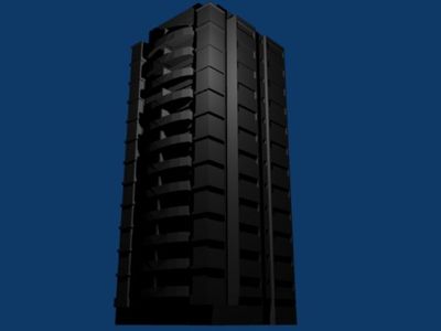
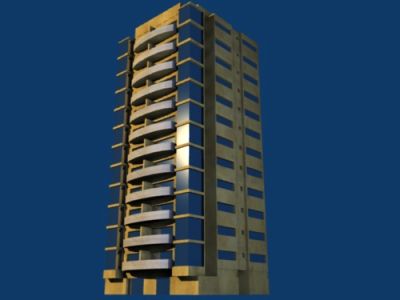
That's it... not exactly stunning,
we could say. If you deleted the default light or if by bad luck
it is inside the building, you might not see any light at all, your
building is then completely black. This is just normal.
No good illumination, no good image. Let's, then, solve that quickly,
because the time passes and it's getting late. |
 |
| |
| 8. THE LIGHTS |
| Lighting is by
far the most important
factor for creating good-looking images. There are many ways and tools
to light a scene, and be able to do it very well is something
that takes much time
to learn.
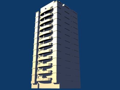
Well, since we just have a bit more than one hour, we'll have to find
some quick way. I'll show you here two quick tricks: a sun &
sky
setup, and a traditional photography studio setup. Both are very quick
to mount and give you fairly basic-but-good result. Gentlemen, to the
left, the sun & sky method, to the right, the photo studio
method: |
|
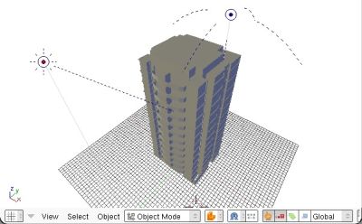
The sun & sky
Here you simply use two type of blender lights: a sun and a hemi
(skydome). The sun is a lamp that has the particularity of having all
its rays parallels. This is the common way we represent the sun here on
earth, since the sun is so far away that all its rays seem parallel to
us. The hemi is a lamp that simulates a skydome, or light coming from
all directions. The combination of both recreates more or less what we
have in real life. Insert those two lamps (SPACE menu > add
>
lamp > sun and add > lamp > hemi) and place them
more or less
this way: |
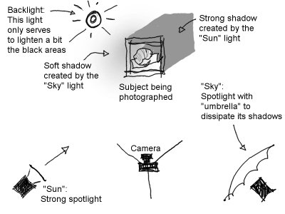
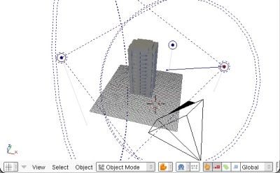
The classical photography studio
setup
This is a quick lighting setup that you will encounter in many 3D
tutorials on the net. It is the classical lights disposition used by
studio photographs. It is also what they teach you when you
learn
traditional drawing. It is very useful in 3D, I always start with it
when I still have no idea about what kind of lighting I want, or, like
now, when I don't have time to try other things.
That setup is made of three lights disposed like in the scheme below: |
 |
 |
Note
that the sun has also
been rotated to point to the building. That's the direction of the
sun's rays. Our shadows will depend on it.
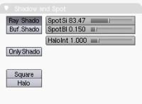
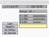
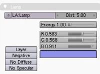
Switch your buttons window to "materials" by pressing F5 and give the
sun a sun color, and the sky a sky color, like in the images below. And
since we want our sun to project shadows, turn on the "ray shadows"
button in the sun material panel. The hemi light cannot project
shadows, unfortunately. |
The first one, the sunlight,
has to be strong to produce sharp shadows. Let's make a spotlight (or a
sun light if you prefer), yellowish color, with ray shadows turned on.
Refer to the sun & sky method here besides. |
 |
 |
 |
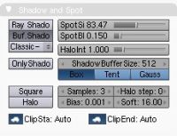
The second one, the skylight,
has to be blueish, weaker, and project soft, blurred shadows. Create a
spotlight, orient it correctly and turn buffer shadows on. Put bias
setting to the minimum possible, and raise the soft value to blur your
shadow. Also set clipsta and clipend values to auto. |
 |
| Then,
render again. and if
you are not satisfied, play a bit with the color and energy parameters
of your two lamps. The position of the sun is also important to make
shadows bigger or smaller. At the end, you shoud arrive to a result
like this one: |
The third one,
the backlight,
can be a simple lamp, with a medium grey color. Disable its shadow,
since shadow is expensive, we won't use where not necessary. Also,
disabling the shadows permit the light to cross the building and reach
the front parts. |
|
 |
At the end, you
must arrive to a setup similar to this one: |
 |
| Your
result can be a bit
different, you can see that I kept the sky intensity quite dark,
because I like to have strong, dark shadows, like if there was a very
hot sun shining. You may want to do something else, but always try to
imagine a real situation, it will be much easier. |
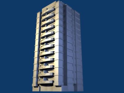
Of
course yours can be a
bit different. Try to vary the height of the three lamps so their focus
areas are not all at the same height. When done, render it, and you
should obtain something like that: |
|
 |
You can see that
both methods give
about the same lighting, but the right one gives us much more control.
Since the blue light is a real lamp, not a simulation, we can place it
where we want and it since it projects shadows, we can have nice shadow
effects on the blue side, and we see the geometry much better. Also,
notice how the down side of the balconies get illuminated too.
You begin to get the trick, don't you? More lights, more
control.
But be careful with that, too many lights make it VERY difficult to
control. Try to stay with 3 lights, it's enough for 99% of exterior
scenes. When you play with light settings, try to be very systematic:
Modify one setting, render, modify other setting, render again. Render
again every time you change one setting. That way you won't loose
yourself. It takes a bit of manipulating to achieve a good image. With
time, you'll get used to it, and you won't need to render that often.
Also, see now why we set up the camera before the lights? The position
of lights, in the right case, depends on the camera. When you make
several views of a building, you usually need a different lights setup
for each. In Blender, you do that creating several scenes.
Last thing, don't forget to take the good habit of giving a name to all
your lights (just like our other objects), so you can recognize them
easily later. |
| |
| 9. THE MATERIALS |
Well, well, we
are almost there,
don't you think? Now let's see what materials we'll need:
1. A base wall material, let's make some sort of colored cement.
2. Another wall material for special elements, like balconies, etc...
Why not try a wood?
3. A glass
Of course here the boss didn't specify anything, we'll have to shoot in
the dark. Well, you must have a small idea of his color tastes, don't
you? Bosses use to have well defined color tastes... I would suggest
making the base wall material in his favorite color. The material 2
should be a color that goes well with the first one. There is a site
that quickly proposes you matching colors for the one you pick. Okay,
we have our colors, let's build the first one. Switch your buttons
window to Materials (F5). Select your appartments, and click the "Add
new" material button. A fresh new material gets created: |
 |
| Let's now fill
this material with
what we want. Play a bit with the three colors values, and everything
you find in the Shaders panel, so it looks more or less, basically like
what you want. I'll pick a light orange tone, and put "spec" value to 0
because I don't want any "glow" (it's a cement... cements don't glow.
Yes I know in Quake they do but we try to stay on earth). When you are
more or less satisfied, let's choose a texture image for
it, for example on cgtextures.
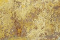
Choose an image, and download it to some place on your computer. Then,
in the Texture panel of our material, let's click "Add new" to, well,
add a new texture... Then, switch your buttons window to Textures (F6). |
 |
 |
| The texture I choosed... |
And the texture
settings. Rename your
new texture, Choose the "image" type, and click the "load" button to
take it from where you saved it. That's it, you have a new texture,
made of your image. |
| Now switch back
to material settings
(F5). Notice that we have a pile of texture slots there, so we can add
more later. Since we created our cement texture, the texture panel
gained two more tabs: a "Map Input", for specifying how the texture
will be placed, and a "Map To" for specifying what the texture will
affect. Let's configure that for our cement: |
 |
These are the settings I choosed in the Map Input and
MapTo
tabs. They are exlained below. Feel free to experiment with all those |
In "Map to"
I activated the "col" button, so our texture will affect the diffuse
color, and "nor" which will affect the bump value (in Blender it is
called Normal). I reduced the "col" value (which, obviously, controls
how much the texture will affect the color) much. Why so much? Well,
the image we took on cgtextures.com is not seamless. That means, its
left side doesn't match with the right side. So, when our image will be
tiled on the building, the seams between the images will be very
visible. Lowering the color value is a quick way to hide a bit those
seams. If we had more time we could also add another texture on top of
it. The "Nor" value, which controls the normal effect, will stay at
0.50 for now.
In "Map Input"
I activated
"Glob" and "Cube" buttons. Glob sets the texture scale to "Global",
meaning "one texture image fits in one global blender unit". In our
case, one meter. The default "Orco" means "one texture image fits in
one object", which would obviously give you different mapping sizes on
different object sizes. Since we make "real world" materials, we use
the "glob" one most of the time. We want our material look exactly the
same on big and small objects.
The "cube" button tells Blender to apply our texture as if it was
projected from a cube, instead of "flat" from above. This what we use
in 99% of the cases in architecture.
Note the size parameters set to 20% (0.20). How does that work?
Remember "one image fits in one meter", right? Now, 20% of an image
fits in one meter. In other words, one image fits in 5 meters. Our
cement texture now is 5mx5m large.
Now our cement is ready, let's test it. Remember we selected our
building before making the material? Well, that means this material is
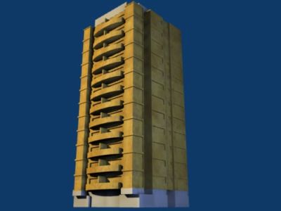
asigned to it already. So, let's render: |
 |
Isn't that great
already? We can see
small problems, on the darker side we can see vertical repetition: 3
same "clouds" one above the other. We could solve that quickly by
making the image twice bigger. Set the size settings to 0.10. That
should do the trick. We could also apply another texture on
top
of it, with different size settings, etc... Texture repetitions are
always a problem with image texturing, and we must always find tricks
to make it disappear. Another solution is to use procedural textures,
(all of blender's texture types other than "image"), which don't repeat
patterns.
Now let's make the second material. Click " Add new" besides the
material name. This will create a copy of our cement. |
 |
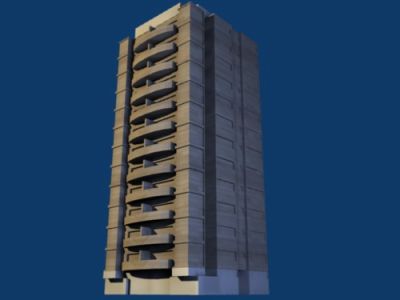
Here I downloaded
a wood texture,
then did "add new" too in the texture panel (our new material was still
using the cement texture), and assigned the new downloaded texture to
it. I left all parameters like they were.
Don't forget to give proper names to your materials and textures. You
certainly understood now that materials and textures are two
different things and materials can use whatever texture they want, so
be sure to have clear names so you know what is what.
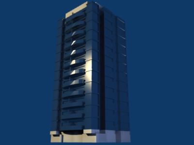
Now let's create our third material, the glass. Create it,
remove
its texture and give it a strong and narrow glow (the "spec" values in
the Shader panel), like below: |
 |
 |
 |
Note
that we removed the
texture ("clear" button besides its name) and activated the "Ray
Mirror" button, and raised the "RayMir" value a bit. Hmm, there's not
much mirror effect appearing on the rendering... That's mainly because
there is nothing to reflect, the mirror is reflecting mirror that is
reflecting the blue background... To look good, mirror materials must
have something to reflect! This will happen right now.
|
Now we have our
three materials, we must assign them to our objects. There are two ways
to do that:
1. Split our objects by material, so each object receives one material
2. Assign several materials to objects, and then control which of those
materials each face receives.
What way will we use? Well, you begin to know me, you know which one
we'll choose, don't you? Number 2 of course. The reason is simple, we
want to leave our objects the way we modelled them. We wouldn't like to
explode our objects to smaller parts, would we? What if the boss, in a
creative crisis, decides to change EVERYTHING? Better to keep our stuff
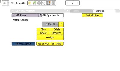
clean and easy to modify. Let's go, then. Select the appartments (which
are probably selected already), and switch your buttons window to
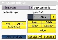
Editing (F9). Our appartments will need cement, wood and glass. so,
locate the "links and materials" panel and create 3 material slots by
clicking "New" two times: |
 |
Here
we gave our object 3
material slots. Then, switch to materials (F5) to fill each of these
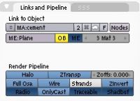
slots with a different material: See the same "3 Mat 3" button? browse
through the three slots, and for each one assign a material. I put the
glass in slot 1, the wood in slot 2 and the cement in slot 3, but the
order doesn't matter. |
 |
Now our object
has three materials,
but we didn't tell which face receives which material. It is very easy
to do. Go back to Editing buttons (F9) and then enter EditMode (TAB
key). Put yourself in Face selection mode (small "triangle" button on
the header). Then:
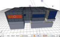
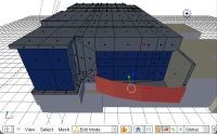
1. Select some faces that will receive a material, let's say cement.
2. In the editing buttons, panel "Link and materials" (like the image
above), select the "cement" material slot (mine is 3)
3. Click "Assign"
Now do that again, with all visible faces, and then with the foot and
the head of our building: |
 |
 |
 |
 |
Don't worry, it
is much faster than
you would think. We cared to model with few faces, so there is not much
work. You can switch off the modifiers in editmode, so it's easier to
see what you are doing. The top part only has cement on it, so I
created only one material slot for it.
When it's done, render again, and there it is, our fully-textured
building is done! Now, if there is time, we can make some small
adjustments. For example, I found my wood material a bit dark, so I
whitened it a bit.
Now, we can relax, the boss can come, the building is there. But since
we still have 15 minutes, let's put some background and foreground,
because the glass still looks very bad. Remember, the glass only
reflects what's around. |
 |
| |
| 10. THE
BACKGROUND AND THE FOREGROUND |
The background
The perfect thing would be if we had
a real photograph of the place. In this case, we don't have any. But
since the boss told us where the building will be, we can go on google
earth to have a look at how the surroundings are. No need to be very
precise here, but we need to know if the surroundings are buildings,
small houses, park, something like that.
Then, we need to make a background. The creative commons
site has a search function for finding images that can be used freely
in commercal works, as well as most of flickr
photos. Just look for things like "city", "landscape", "cityscape" or
your city name. You should find plenty. Once you have one, you may need
to crop it a little bit in your image editor, switch your buttons
window to World settings (F8). There, you'll see you can add a texture,
exactly the same way we did with materials: |
 |
 |
| The texture I choosed... |
And the "World"
settings. notice that
"Paper" is turned on, and how you use the sizeX, Y, Z and dX, dY, dZ to
crop the image to exacly what you need. |
| You'll need to
render a couple of times to adjust the d and size parameters. When
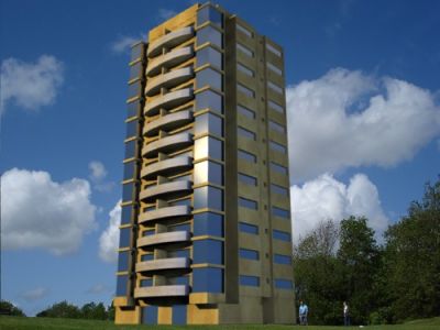
done, it looks like this. |
 |
Now
notice how our glass improved,
specially on the darker side. But on the front side it is still a bit
uniform blue. We can do several things to that, a common trick being to
add a landscape or sky texture to our glass material. In other words,
create an "artificial" reflexion.
But since our image is still a bit naked, let's add some real
foreground objects, they will serve the double purpose of being
reflected and "frame" our composition. |
The foreground
Here you can put all kind of objects: Trees, cars, people, streetlamps,
etc... We can add this as 3D objects, if you search a bit on the net
you'll find many free 3D objects to use, but the quickest way is to add
images that have transparency in them. Traditionally 3D artists use to
put this in an image editing program after the rendering, but it's much
better to add them directly in blender, so you can change your model,
render again, and no need to open another program again.
Those images with transparency (or alpha layer) are very hard to find
on the net, but you can find a couple of them free to use on the blenderarchi
site. You can also grab free samples from several texture vendors such
as marlin
or got3d.
So, let's take two trees from there and place them in our scene. Since
they are images, all we need to do is to make two big plates, or
billboards, on the front of our scene, and make a new material for
each, with our tree images as textures: |
 |
 |
| A couple of simple planes oriented to face the camera... |
The
texture settings for
our new materials, note the "use alpha" button pressed, this, of
course, only works if our image has an alpha layer... |
 |
... And the
material settings. Here
we have the "A" value to 0 because we don't want the grey color to
appear, "ZTransp" (basic transparency) turned on, "Traceable" and
"Shadbuf" turned off because we don't want our trees to project shadows
on the building, and the "Alpha" button in MapTo switched on because we
want the alpha transparency from the texture to act on our material. I
also turned on "Shadeless" because these tree images are already
lightened, so we don't need our lights to alter that.
|
| Well, I think
that's it... Time to do a big scale rendering. Put it at 100% in the
rendering (F10) buttons... |
 |
Note that I also
made two more copies of our trees to mask a bit our entrance, since it
is not very well defined.
Now it's about twelve, all we need to do is to print and give it to the
boss. Probably, he will be back from the meeting with many changes to
the building, but now, we know we'll be able to modify it easily.
Well, that's it, I hope you enjoyed. If something is still unclear or
if you are struck somewhere, you can download the blend file of this
tutorial, and if nothing helps, just mail me!
Cheers
Yorik - yorik.orgfree.com
with big help from Eon! |
Ah, there is now a sequel to this tutorial, called Modeling architecture with precision in blender. Enjoy!
|

|
