What I do:
-
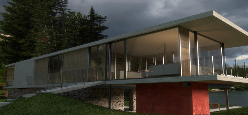
Architectural design
Architecture work I do with our two architecture studios, Uncreated, located in São Paulo, Brazil, and OpeningDesign in Madison, WI, USA.
Check a selection of projects on this blog. -
-
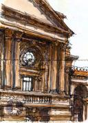
Urban sketching / comics
I do a lot of urban sketching, check my sketches and comics on this blog or follow me on Instagram. Also have a look at the São Paulo, Brazil or International Urban Sketchers groups... -
Cooking
Recipes anyone? My own ones, including a flagship section of belgian recipes (in portuguese). Extracts from our Inventário blog. Receitas? Minhas próprias, incluindo uma seleção especial de receitas belgas.
Latest articles:
-
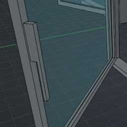
FreeCAD News 29
Exciting new features coming to FreeCAD!26.05.2025 in freecad , opensource , nativeifc -
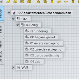
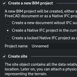
FreeCAD and native IFC tutorial
A tutorial about native IFC and BIM in FreeCAD24.01.2025 in freecad , opensource , nativeifc -
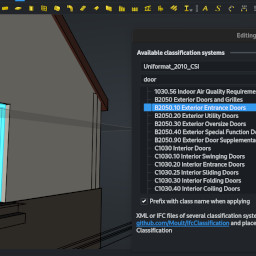
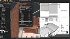
FreeCAD BIM update 28
Serious news about BIM development in FreeCAD15.01.2025 in freecad , opensource , nativeifc -
-